NEP Rebrand Concept
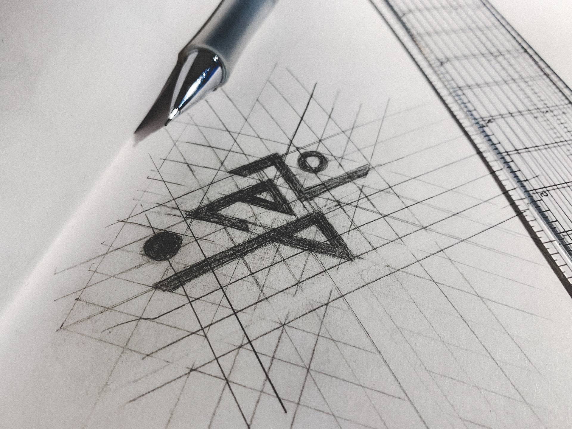
New England Premiership, or NEP, is a youth soccer league for clubs throughout New England focused on player development. This rebrand takes its previous logo concept and streamlines it with a purely geometric and modern visual language, communicating dynamic simplicity with a competitive edge.
Adobe Illustrator


No More Youth Logo Refresh
Given a notebook sketch as reference, I digitized and refreshed the wordmark for metallic hardcore outfit No More Youth. Vectorizing and rearranging each individual point by hand, a new logo with more visual balance was formed with respect to the unique character of the original letterforms.
Adobe Illustrator
Framingham State University 'Register Now!' Campaign Logo Set
In spring semester 2024, FSU launched a marketing campaign to encourage early class registration. Taking small liberties with the existing branding and creating a unique variation of the emblematic Rams horn, I put together a simple and readable logo set for usage on a range of printed and digital applications.
Adobe Illustrator
Coyame Creek Branding/Package Design Concept
Coyame Creek is the spirit that brings Sotol, the pride and heritage of northern Mexico, to the masses. The design maintains an aesthetic that is consistent with its high price point, place of origin, and target demographic. It speaks of history and culture with a contemporary and accessible refinement.
Illustrations by Ckylah Murphy
Adobe Photoshop
The Movie Paradise Brand Assets
The Movie Paradise is a blog that offers reviews and commentary on a wide range of cinema. Using a monochromatic color scheme, I created a simple yet flexible set of logos with a typographic pairing that is efficient and clean. Amongst a saturated market of online critics, the branding communicates professionalism and trustworthiness with a memorable, no-nonsense visual vocabulary.
Adobe Illustrator
